
Tattoo Colours and Skin Tone: Picking Shades That Last
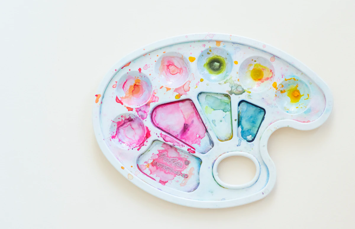
One of my favourite questions in the DM box is also one of the hardest to answer in a quick reply: will this colour actually look good on my skin? It is a great question, and the honest answer is a bit longer than yes or no.
Almost every colour can work on almost every skin. Colours simply behave differently depending on what is underneath them. Once you know how that works, picking a palette stops feeling like a gamble and starts being one of the nicest parts of the whole process.
Your skin is the paper, and it is never plain white
Tattoo ink does not sit on top of the skin the way paint sits on canvas. It settles into the dermis, under a thin and slightly see-through layer that already has a colour of its own. Every pigment we use is being viewed through a soft filter. The same yellow can look sunny on one arm and gently muted on another, and nothing went wrong in either case.
Two things shape that filter. Depth is how light or deep your skin is, and it decides how much light travels back out through the ink. Undertone is the quiet colour sitting underneath, usually warm and golden, cool and pink, or neutral and olive, and it decides which shades feel harmonious and which feel slightly off.
Finding your undertone in about ten seconds
No lab test needed. Stand near a window, skip the shop lighting, and check three easy things.
- Veins on your inner wrist that look greenish, gold jewellery that suits you, skin that tans before it burns: warm undertone.
- Veins that look blue or purple, silver that looks better on you than gold, skin that burns first: cool undertone.
- A mix of both, or a soft olive cast: neutral undertone, and most palettes will behave beautifully.
- Deeper skin sends back less light through the ink, so pale pastels drift into the background while saturated colour really sings.
Colours that hold their punch
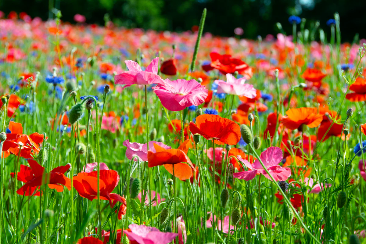
If you want colour that still reads clearly from across a room in ten years, look at the saturated end of the palette. These pigments are dense enough that they do not depend on the skin lending them light, which is exactly why bold, playful work ages so nicely.
- Poppy red and warm orange are glorious on warm and deep skin and stay easy to read for years.
- Emerald, teal and cobalt love cool undertones, and they keep their crispness on deep skin too.
- Magenta and berry pink are far sturdier than baby pink and keep their character as they settle.
- Mustard and ochre give you the warmth of yellow with much more staying power.
Colours that need a little help
White highlights, pale pastels, pure lemon yellow and light grey are the delicate ones. They are not off limits at all, and I use them often, they just need a plan. I like to give them a neighbour: a slightly stronger shade beside them, or a soft outline holding the shape, so the design still reads perfectly even after the lightest tones settle and soften.
On deeper skin the trick is contrast rather than brightness. Instead of light against skin, we build colour against colour, so the shapes carry the design. And whatever your palette, sun is the one thing that fades everything equally, so daily sunscreen does more for your colours than any product on a shelf. There is a whole guide on keeping colour tattoos vibrant if you want the details.
How we choose in the studio
Here is the part people are always surprised by: I never decide a palette from a photo. On the day, we put the stencil on your skin, open the pigments you are curious about, and hold them right next to it in daylight from the studio window. Two minutes later the answer is obvious to both of us. Naive style makes this easier too, because the shapes are simple and confident, so colour has room to breathe.
- Choose in daylight. Studio lamps and phone screens both tell little lies about colour.
- Look at the whole design together, not one colour on its own. Balance is what your eye actually reads.
- If you want to be extra sure, we can place one tiny test dot somewhere easy to cover and look at it again a few weeks later.
Still deciding? Bring a mood, not a copy
Save three to five references of colour combinations you love, from anywhere: a scarf, a cafe wall, a bunch of flowers at the market. I am not going to copy them, I am reading the mood. From there we build a palette that belongs to you and to your skin, not to someone else's photo.
That is really the whole approach at our little studio in Bangkok. Colourful florals, soft doodly lines, and enough time set aside that nobody feels rushed into a palette. Your tattoo is going to live on you for a long time, so the ten extra minutes we spend holding pigment caps up to the window are always worth it.
If you are curious which colours would suit you, send a daylight photo of your skin and the idea you have in mind to @naive.flora.tattoo on Instagram and we can talk it through. You are also very welcome to browse the flash designs for palette ideas, and we will happily adapt any of them for you.
Flash designs in this themeFlowers
Related stories
 Butterfly and Flower Tattoos: Meanings and IdeasWhat a butterfly tattoo means, how to pair one with a flower, and the sizes, placements and colours that age wRead article
 Birth Flower Tattoos: Your Month, Your FlowerThe birth flower for every month, what each one means, and which ones actually tattoo well small, in soft naivRead article
 Small Flower Tattoo Ideas That Still Look Good LaterTiny floral tattoo ideas that age well: which flowers shrink beautifully, how small is too small, and where a Read article